MedicineCare
- Client
- MedicineCare
- Year
- 2026
- Scope
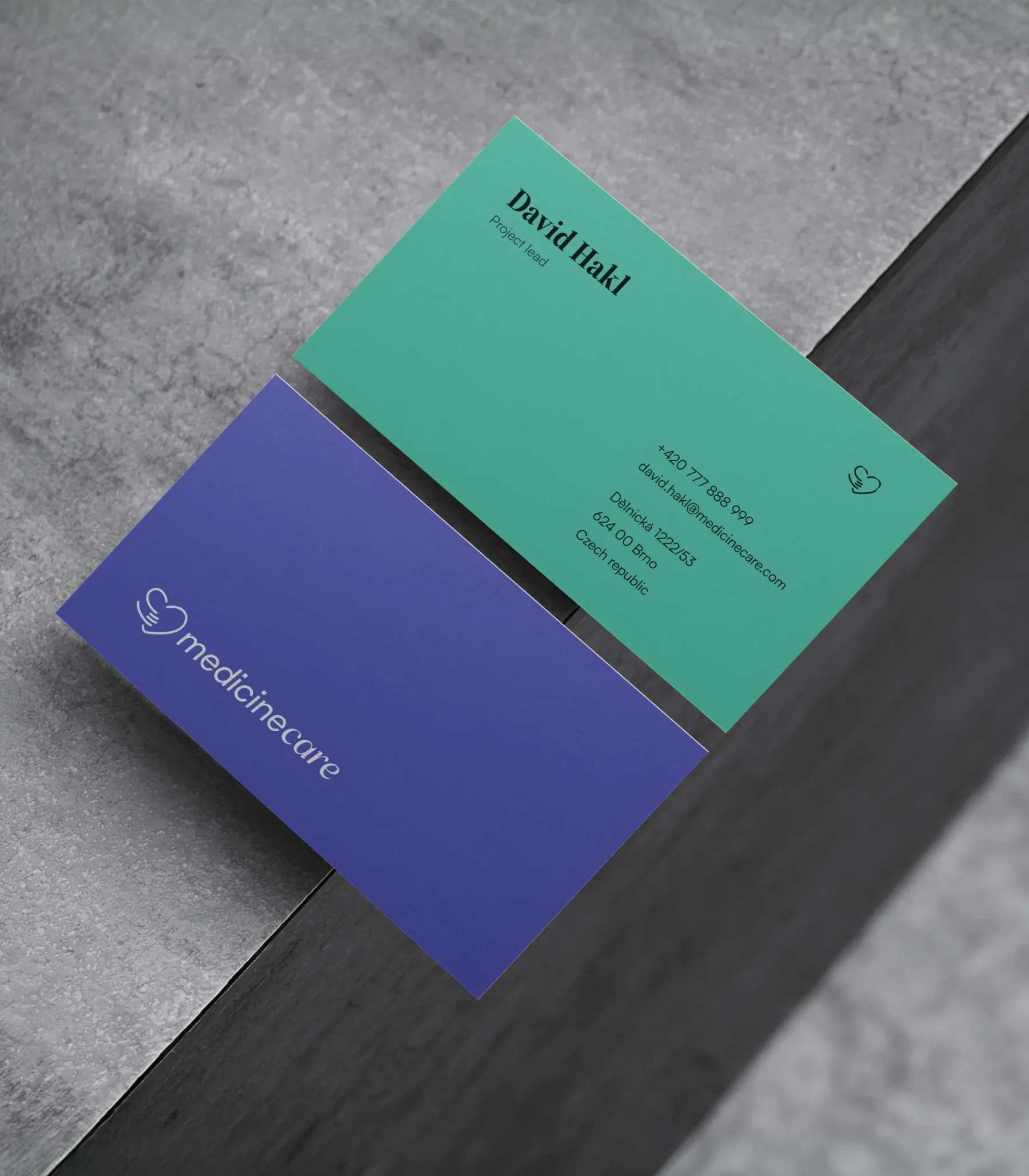
- Brand identity, Logo, Visual system, Print & digital assets
MedicineCare treats pain and skin in Brno, and its patients come from every age and every budget. The clinic had the expertise; what it lacked was one face. The new brand gives it one — calm, competent and human before a single word is read.

Context
MedicineCare is a private clinic with two specialisations: pain therapy and dermatology, insured and aesthetic. Good doctors, loyal patients, and a visual presence that had grown piecemeal, each service looking like a different company. A brand workshop set the direction — a single mother brand that could hold every specialisation, present and future, and let the clinic's prices catch up with the quality of its care.


Serious, not cold

Challenge
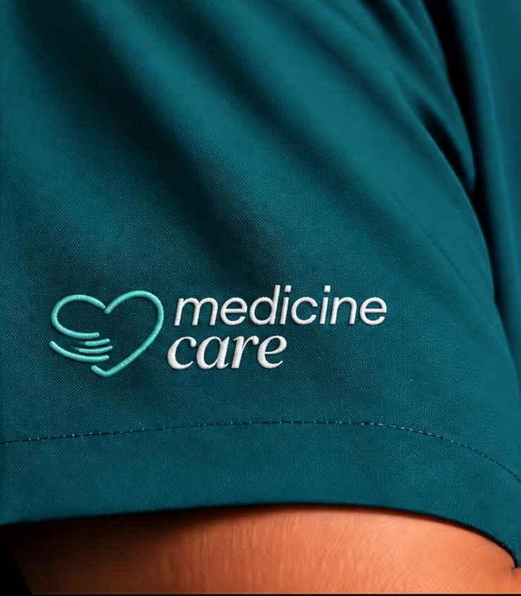
The workshop sliders were unambiguous: humane, conservative, strict, serious, very restrained, warm. That is a narrow target. Medical brands slip easily into one of two failures — the cold institution or the wellness cliché. This one had to hold trust and warmth at once, work for a pensioner with chronic pain and a thirty-year-old booking aesthetic dermatology, and survive on a scrub pocket as well as on a lightbox.
A hand that holds a heart

Solution
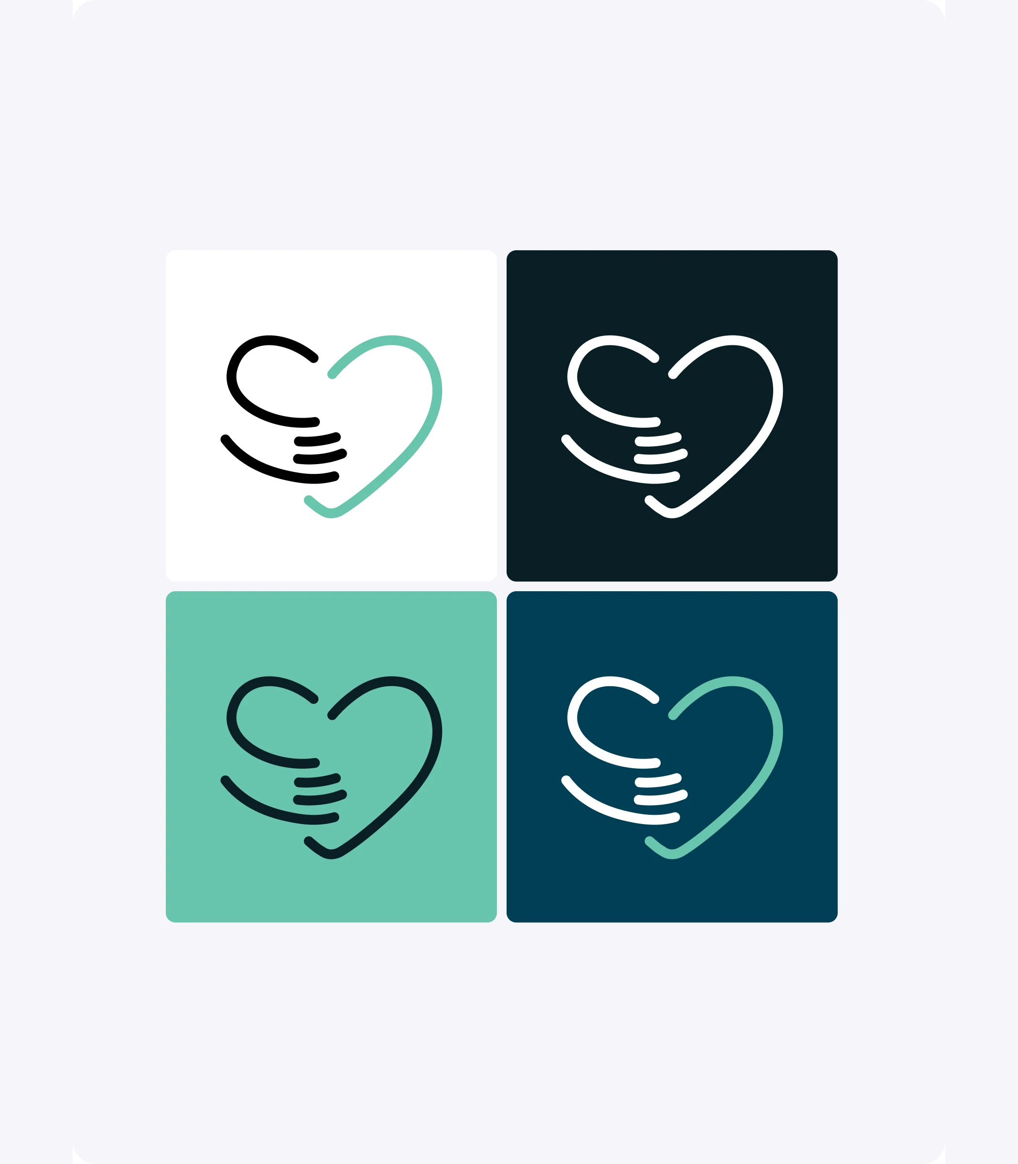
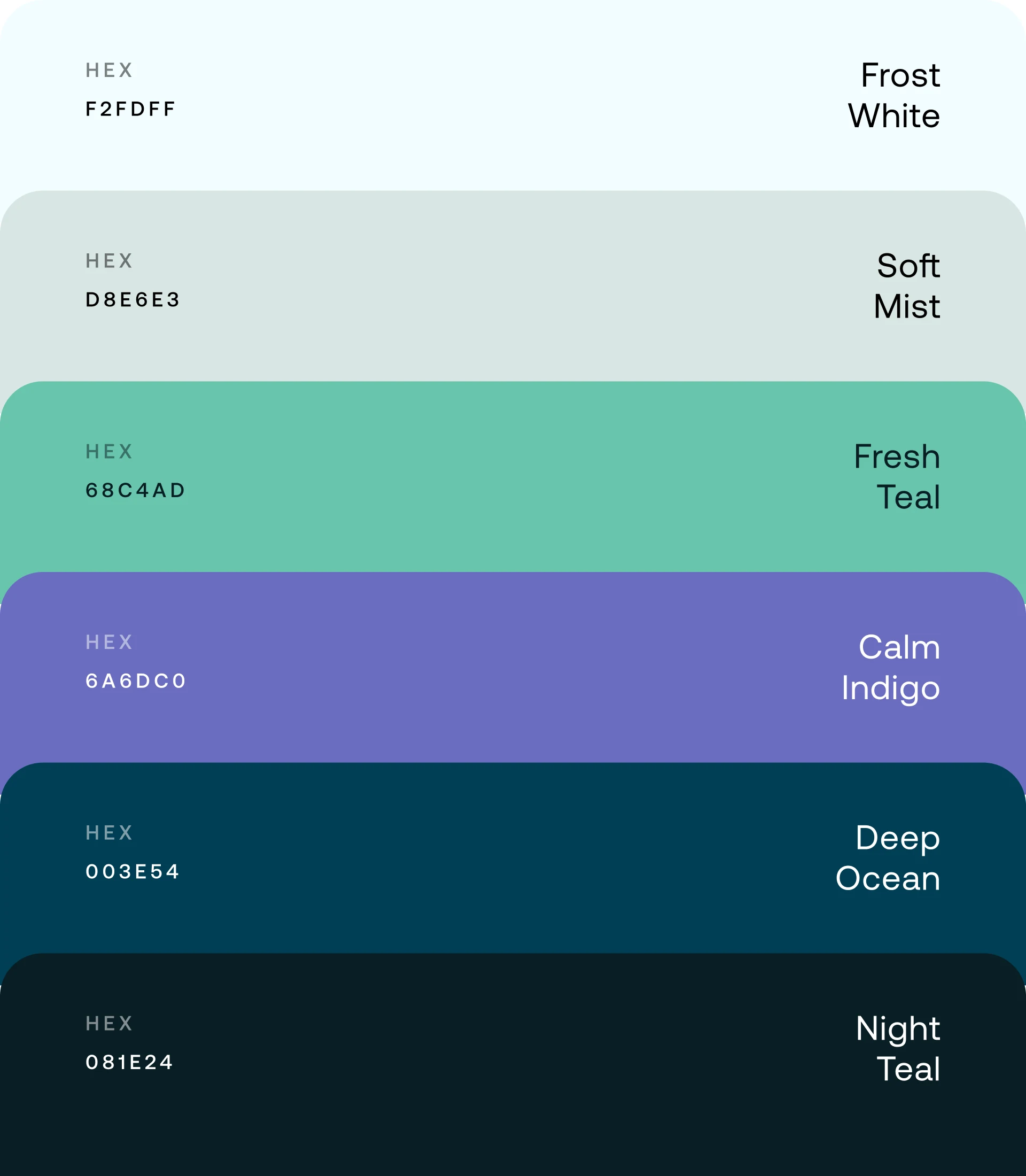
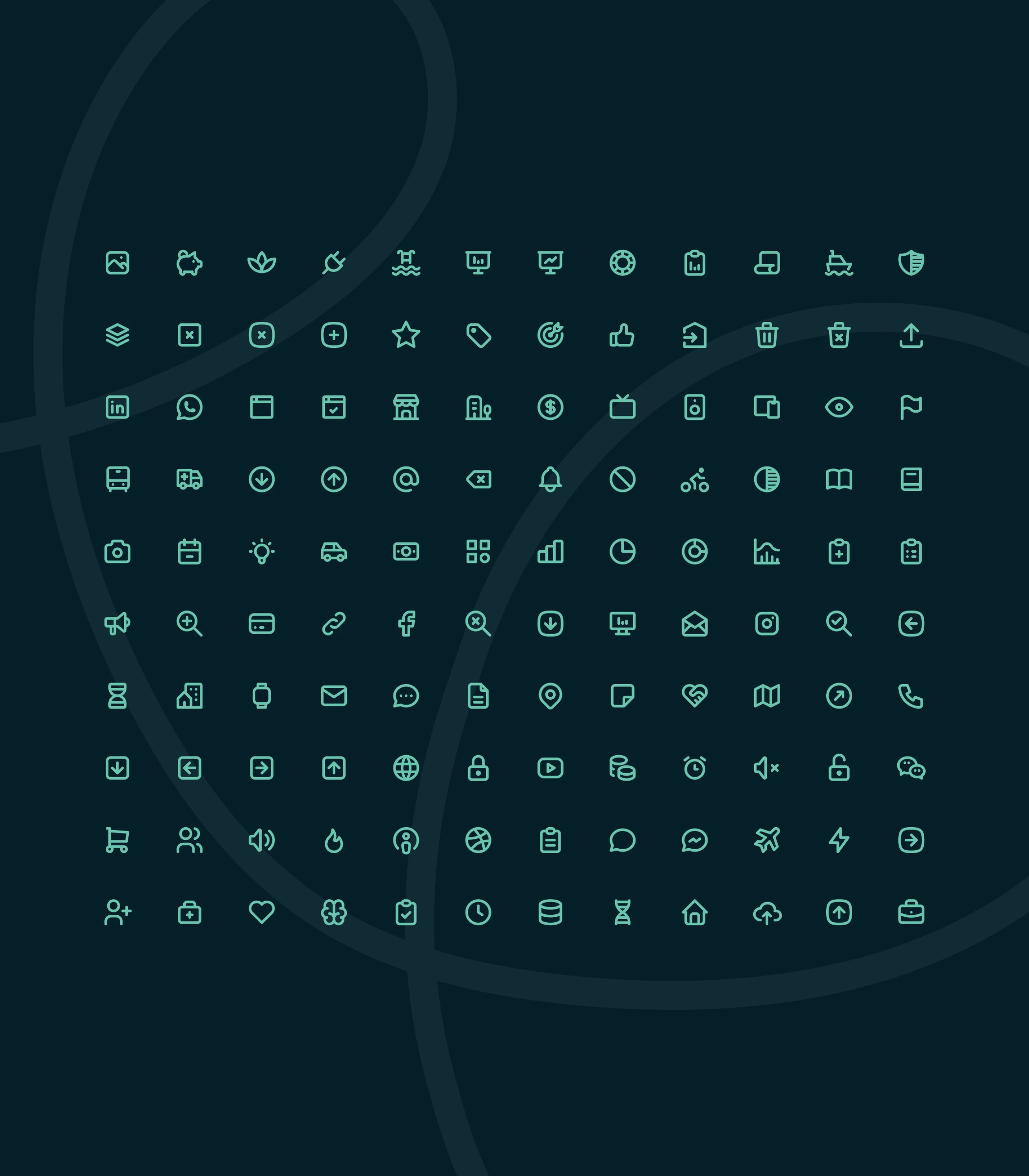
The symbol is a heart drawn as two hands, one holding the other — care as a gesture, not a cross. The wordmark sets 'medicine' in Satoshi and 'care' in a serif italic, so the name itself carries both halves of the promise. Six colours: Deep Ocean and Night Teal for authority, Fresh Teal and Calm Indigo for warmth, Frost White and Soft Mist for air. An icon set, a slide system and social templates put the system into everyday use; business cards, badges, roll-ups, scrubs and a waiting-room lightbox take it into the building.