Liberty Choice
- Client
- Liberty Choice
- Year
- 2026
- Scope
- Brand identity, Website, Web app, Mobile app

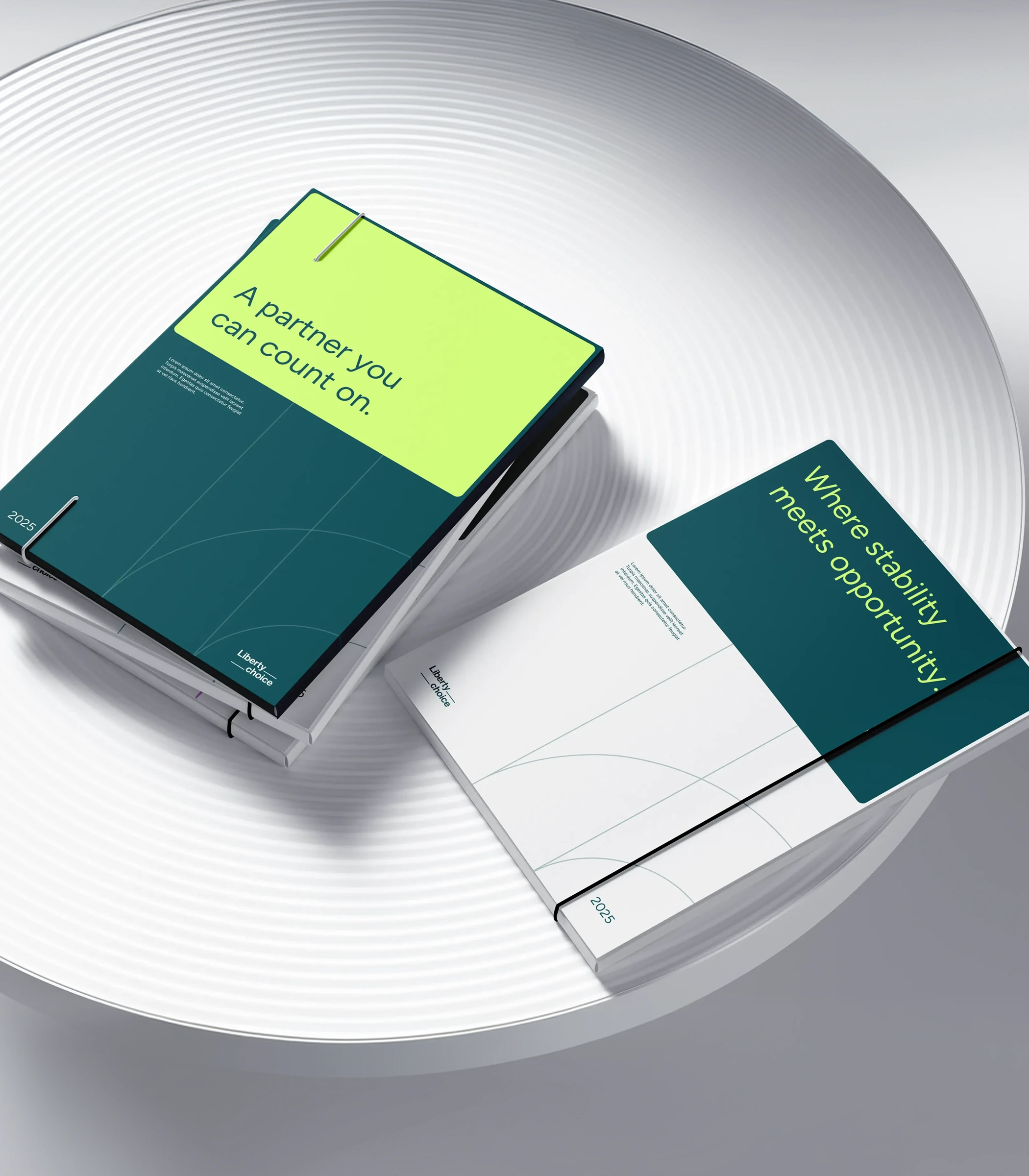
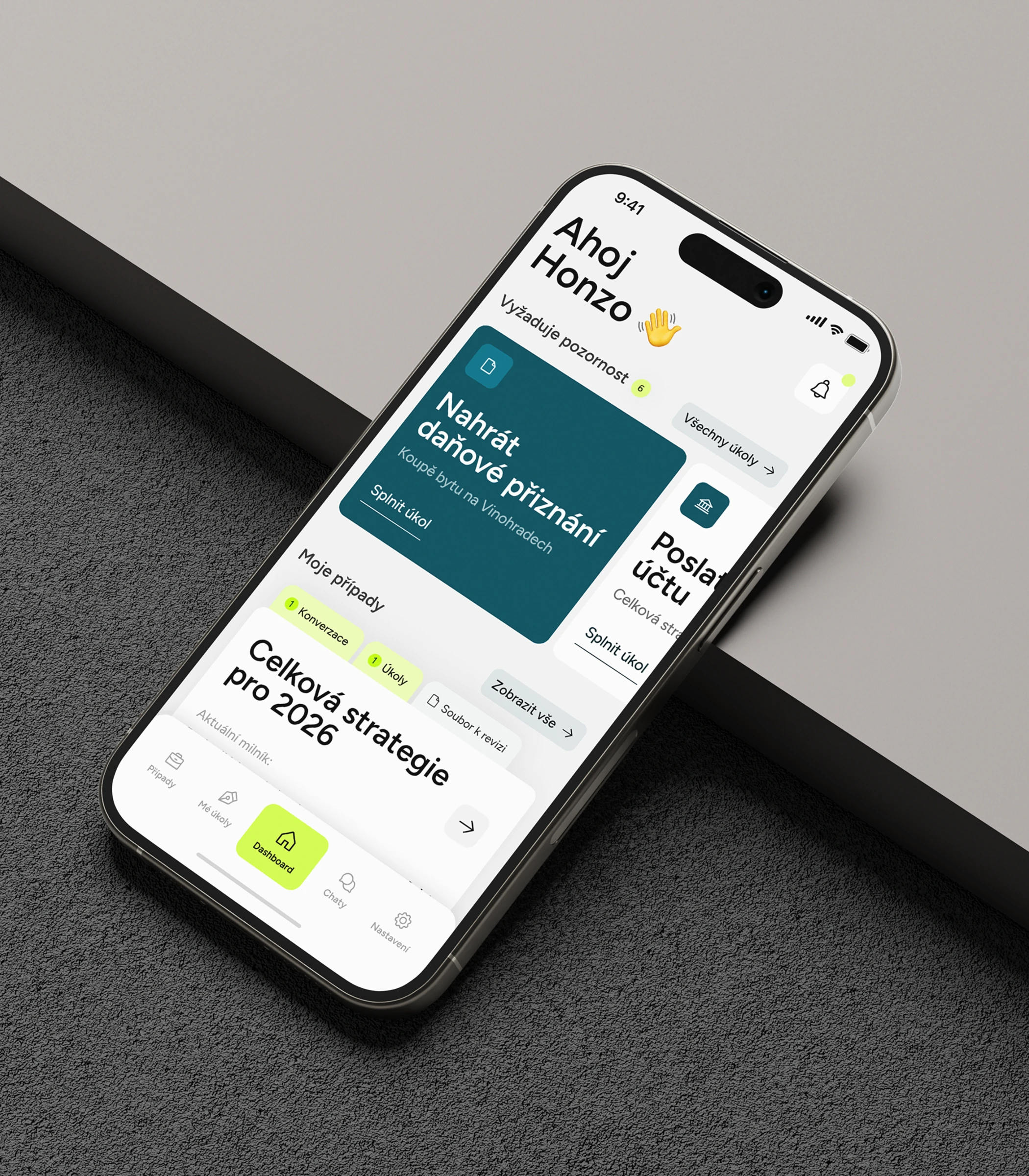
Liberty Choice builds property portfolios for people who would rather have a clear next step than a hundred options. That promise got a face and a set of tools: a new identity, a website, a client web app and a mobile app — all speaking one language.

Context
Liberty Choice is a Prague firm that plans, finds, finances and manages rental property for private investors. It had outgrown its old look and its spreadsheets: clients wanted their portfolio, their cases and their advisor in one place, and the company needed a brand that reads as trustworthy without going stiff. The brief covered everything a client touches, from the business card to the app icon.
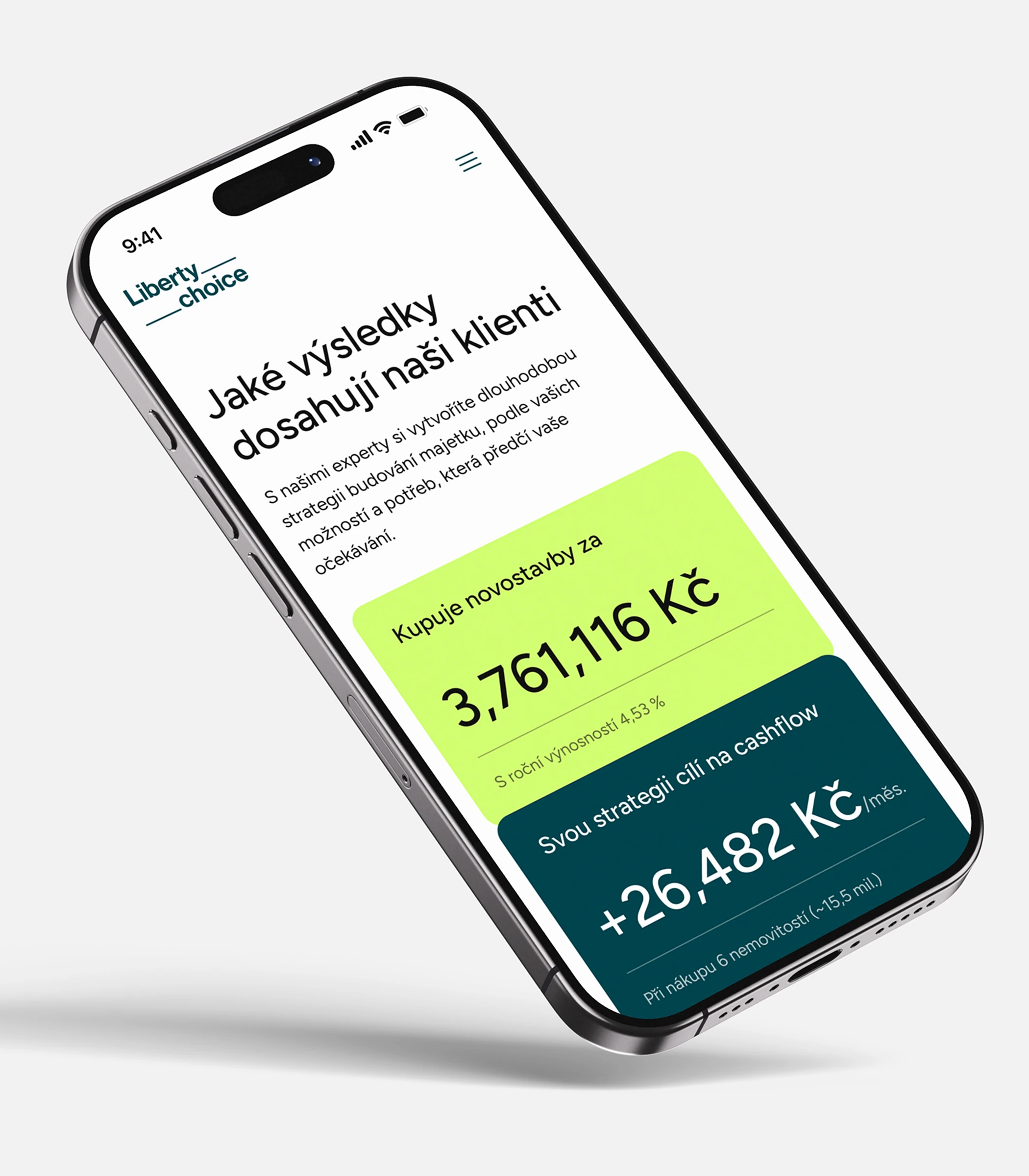
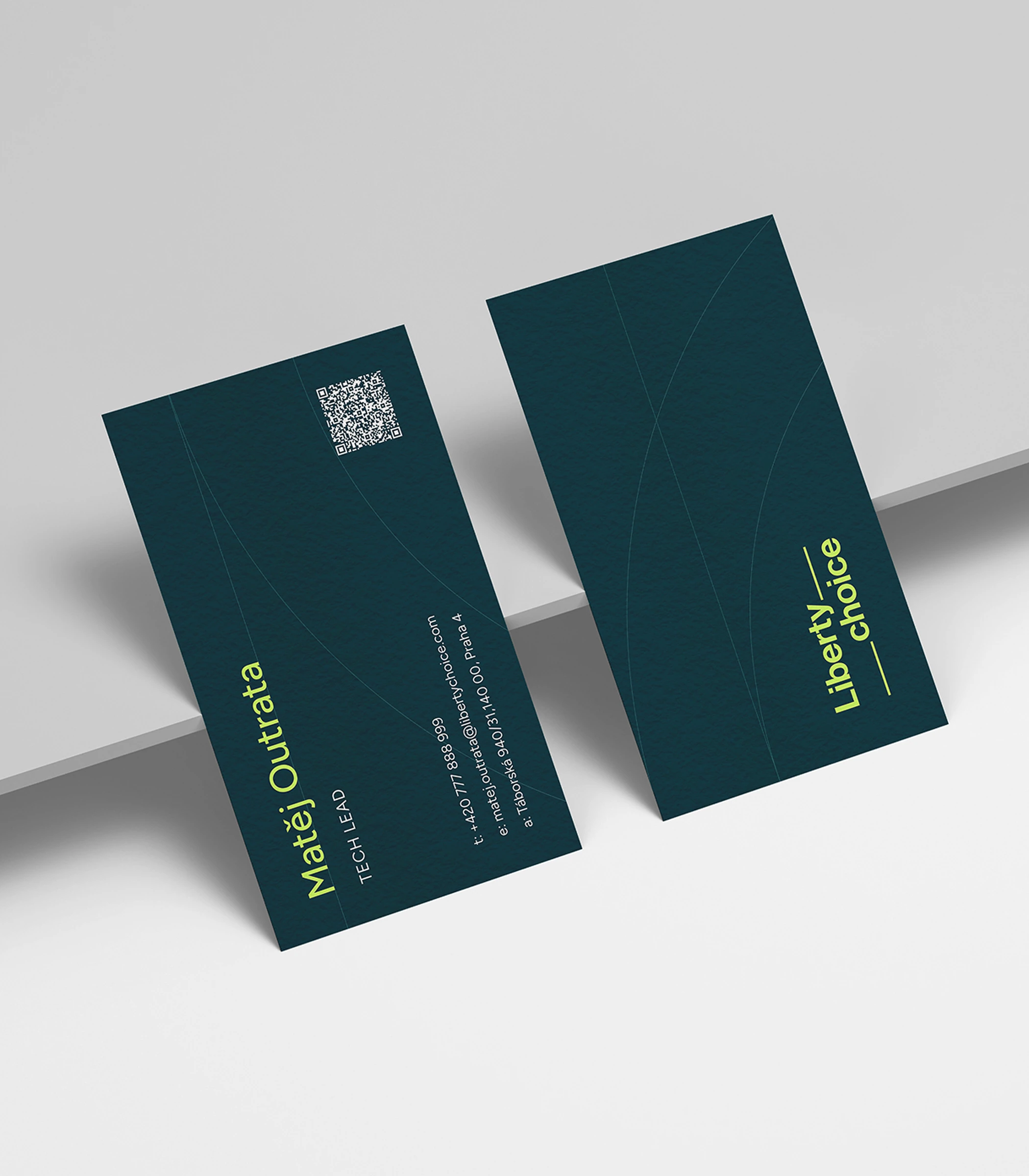
One idea, four surfaces

Challenge
The risk was four disconnected products: a print brand, a marketing site, a dense web app and a lightweight phone app. Each has its own job, density and audience, yet a client meets all four in the same week. So the identity had to bend without breaking — from a billboard to a KPI card to a task on a phone — and the products had to share one vocabulary: cases, tasks, messages, portfolio.
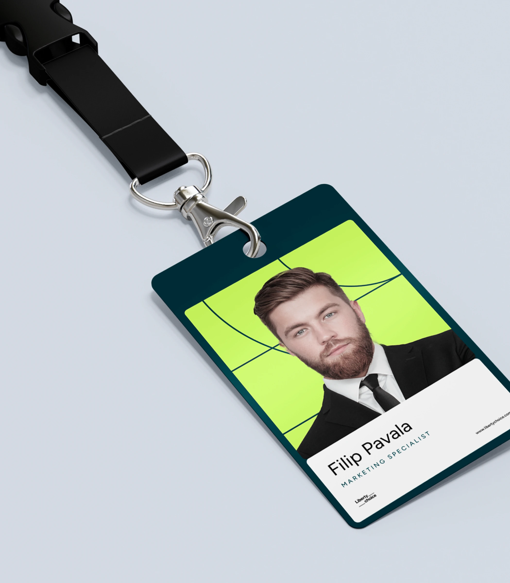
Navy for trust, lime for the next step


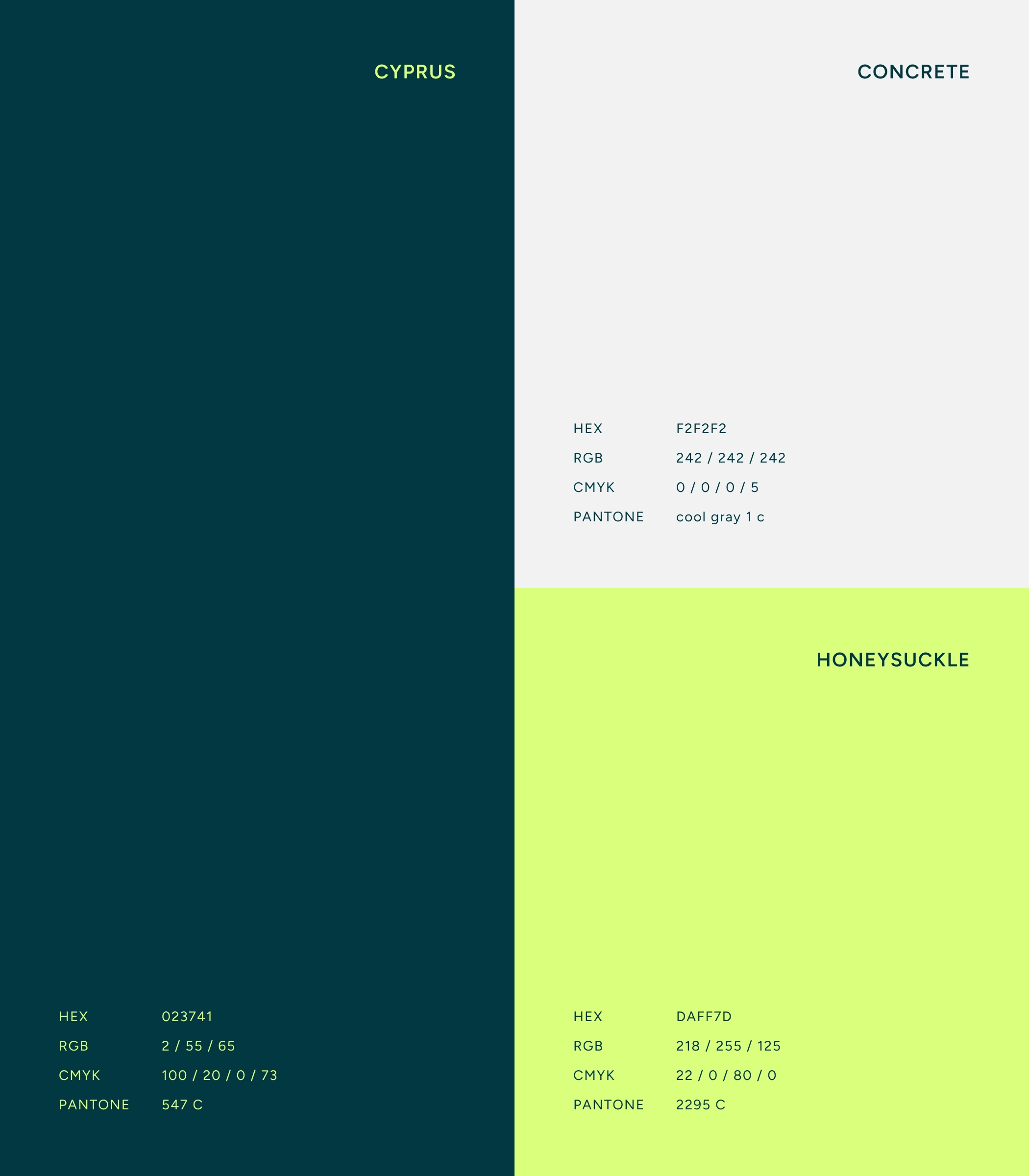
Solution
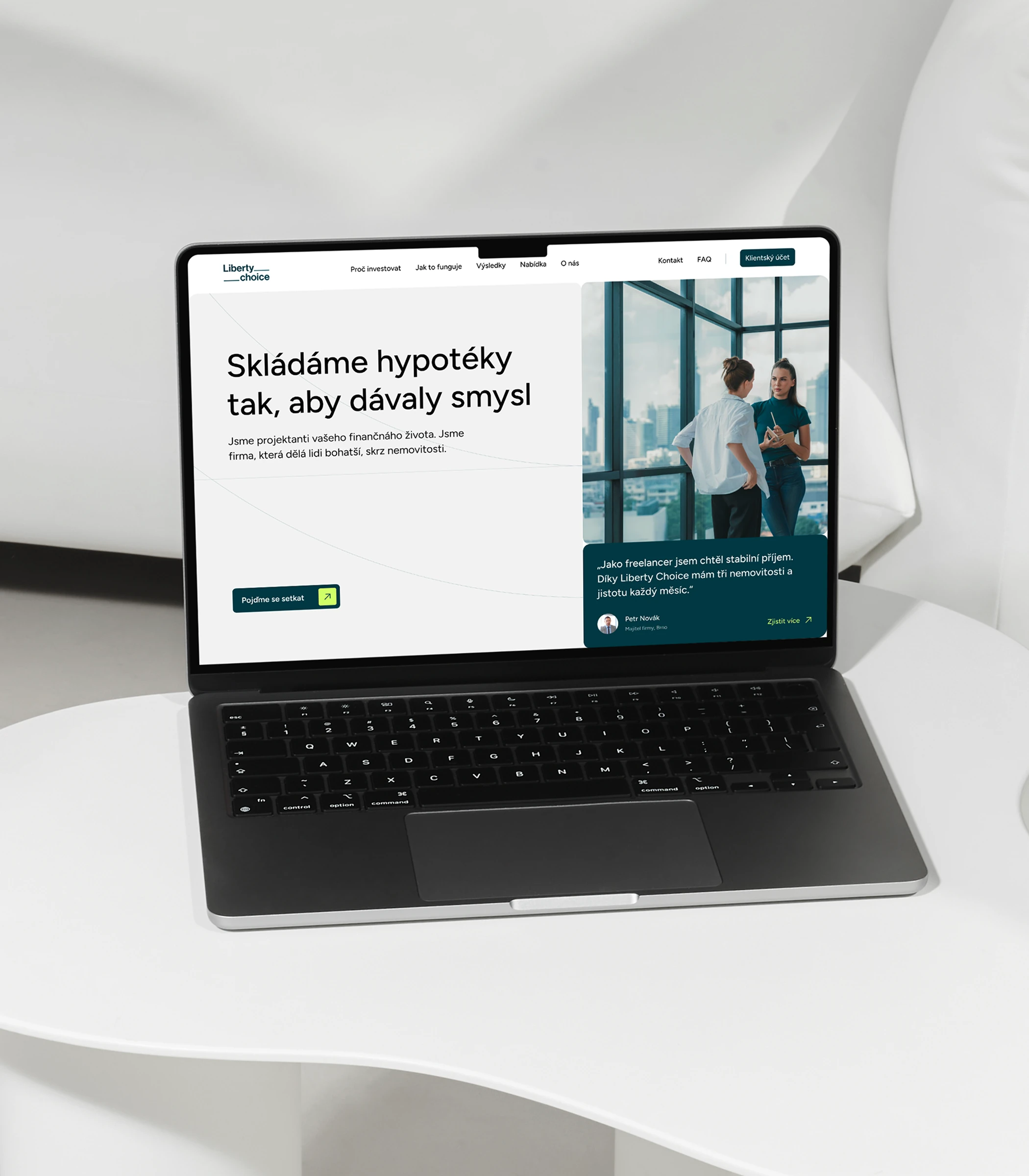
The identity rests on two colours: Cyprus, a deep teal-navy that carries trust, and Honeysuckle, a lime that marks the next step, plus a wordmark whose underline grows into the arcs that run through print, badges and screens. The website tells the story and shows real results. The client web app puts portfolio, loans, insurance, documents and property offers into one overview. The mobile app strips that down to what matters today: the open task, the active case, the advisor in a chat. Same colours, same words, same underline. Website built together with Inventi.