GRAIN
- Client
- GRAIN
- Year
- 2026
- Scope
- Brand identity, E-commerce, Shopify, Art direction
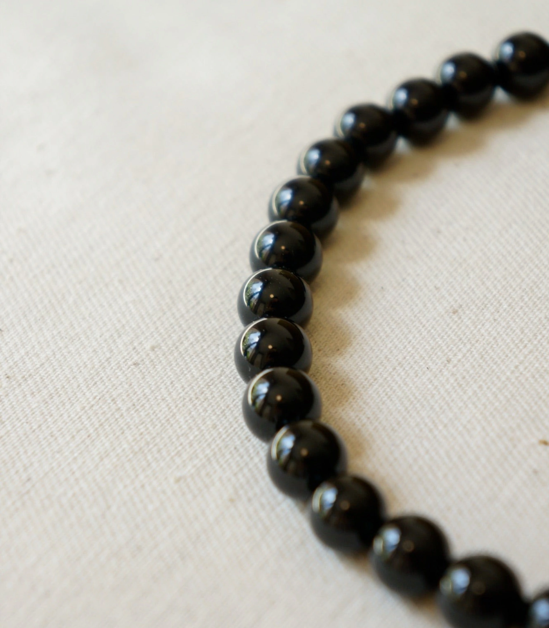
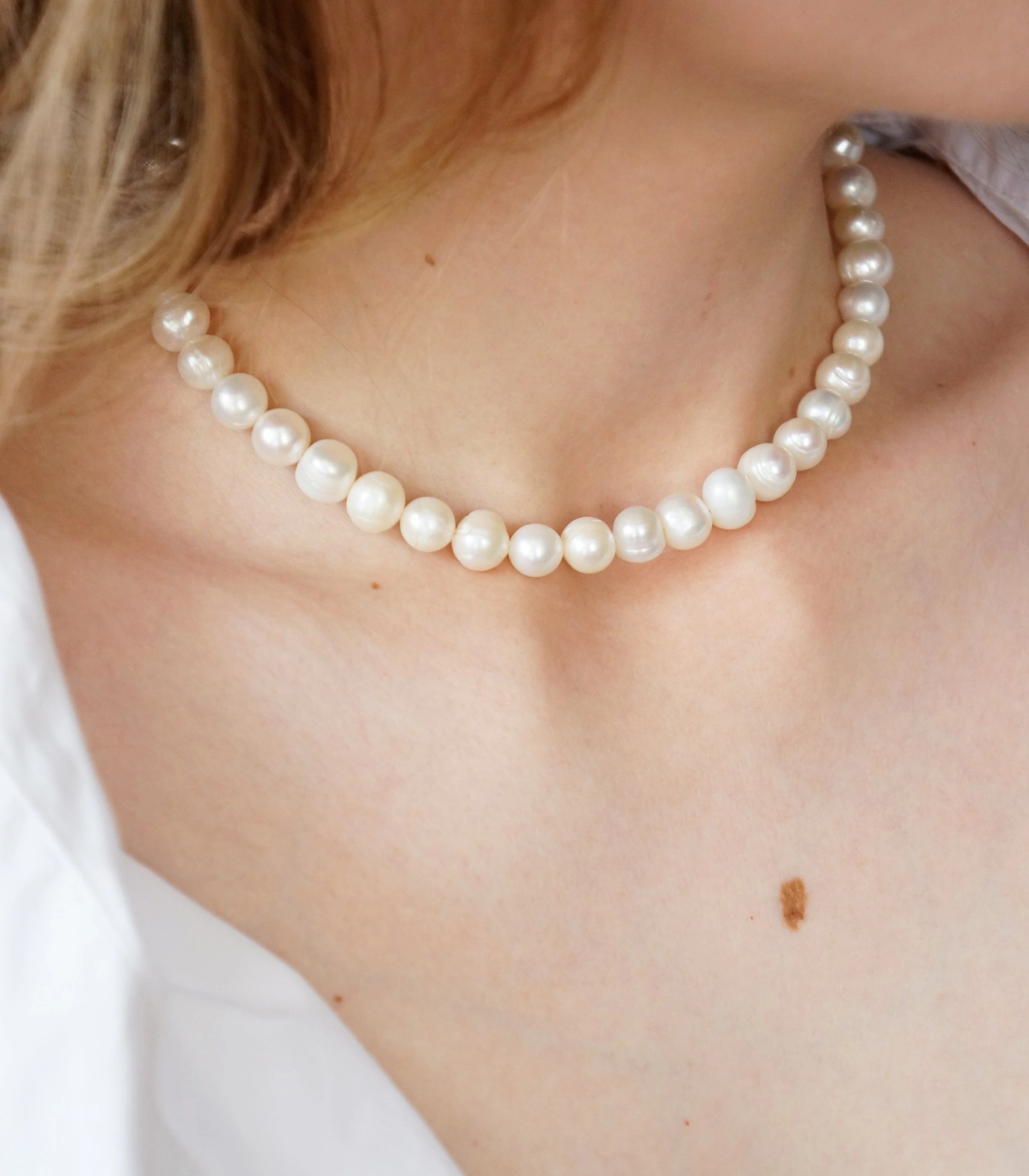
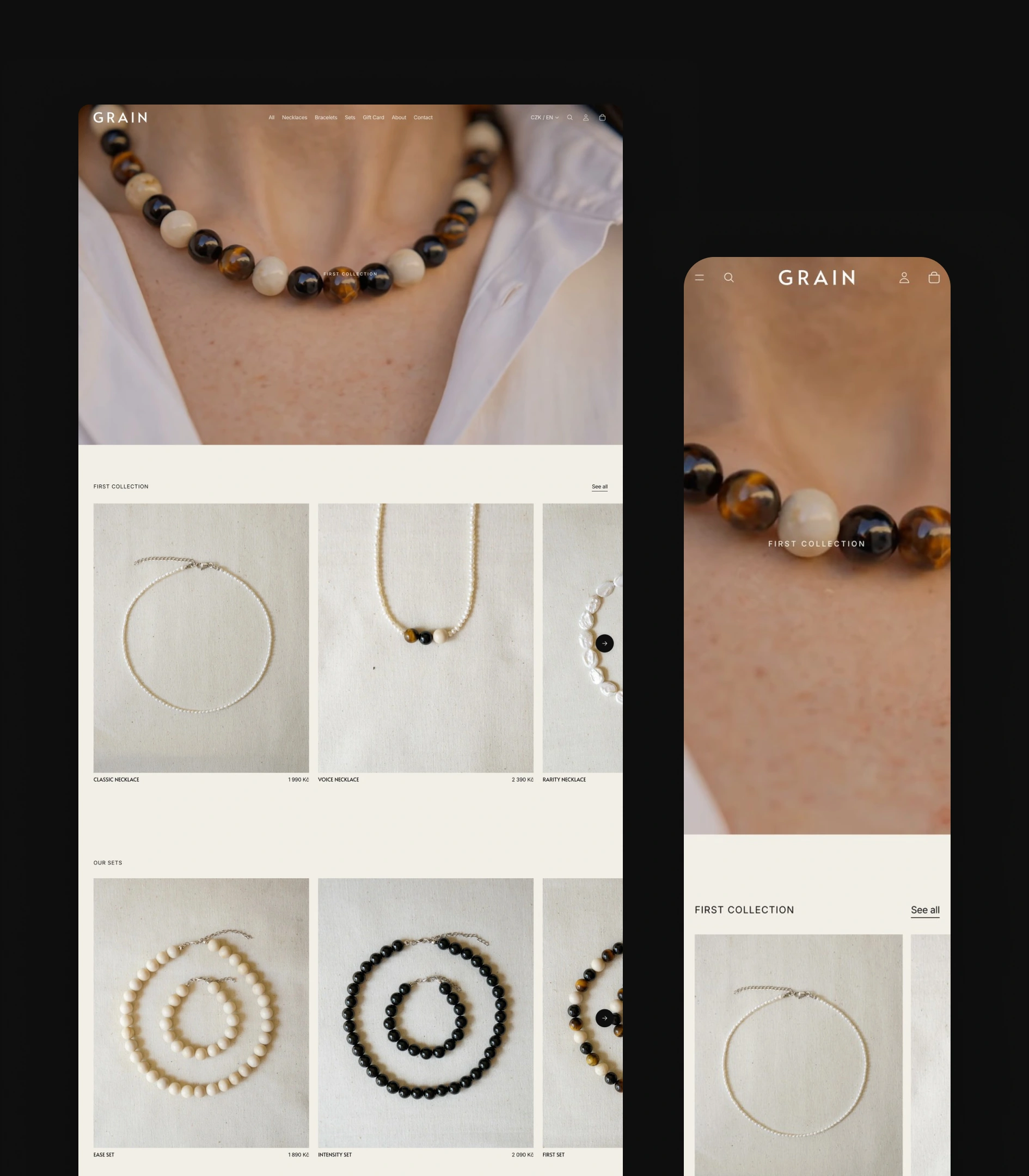
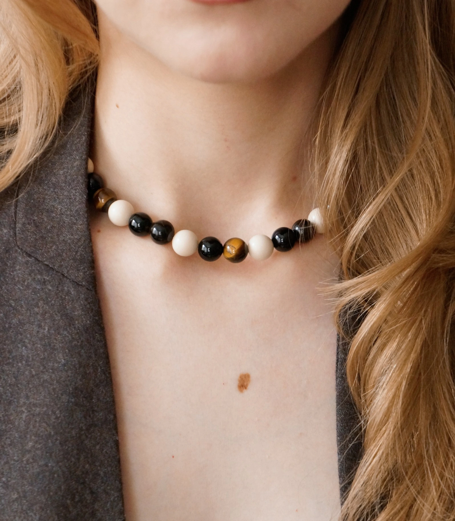
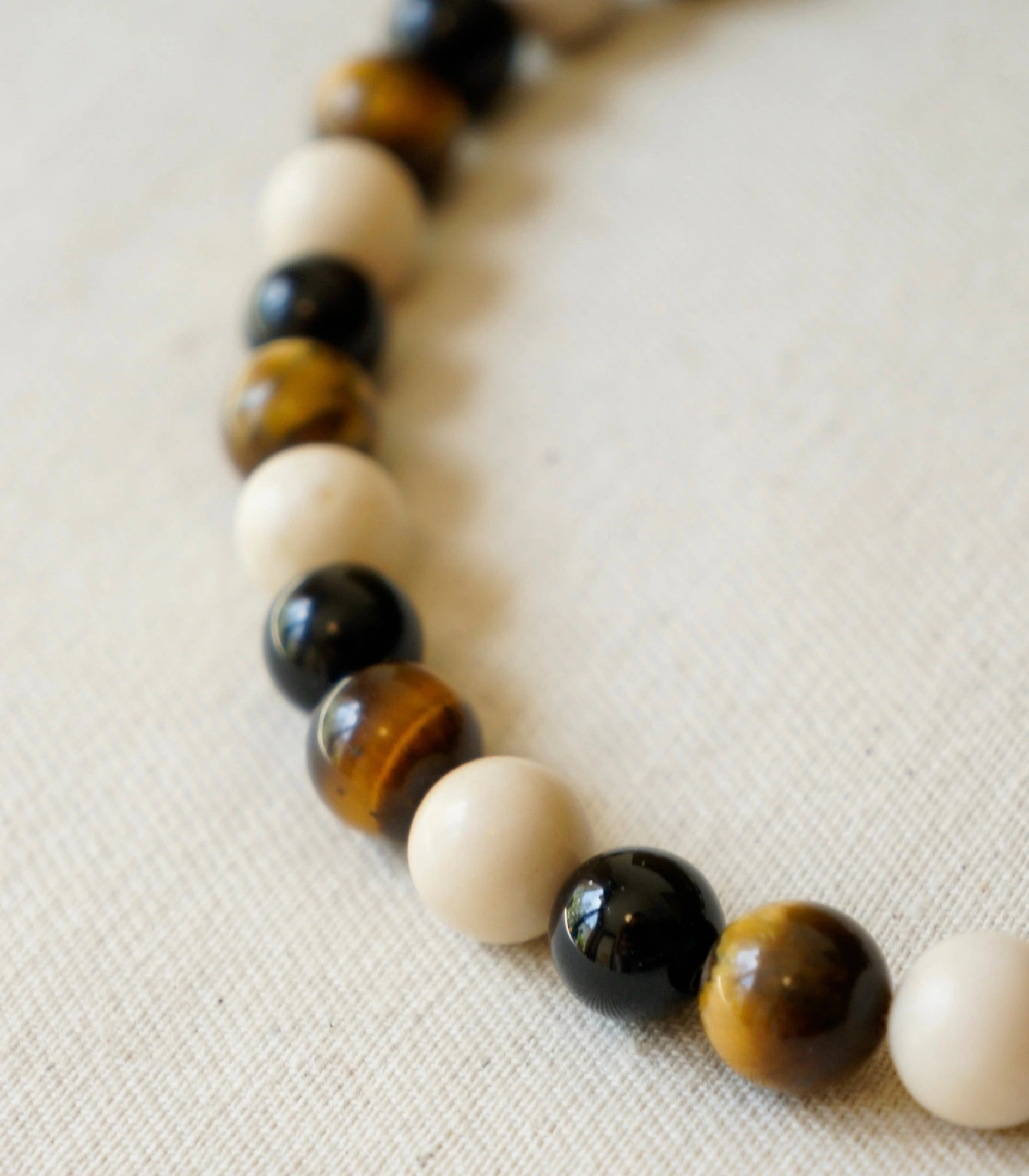
GRAIN strings natural stone and freshwater pearl by hand in Prague. The pieces are quiet by design, and so is everything around them: the identity, the packaging and a Shopify store built without an agency or a development team.

Context
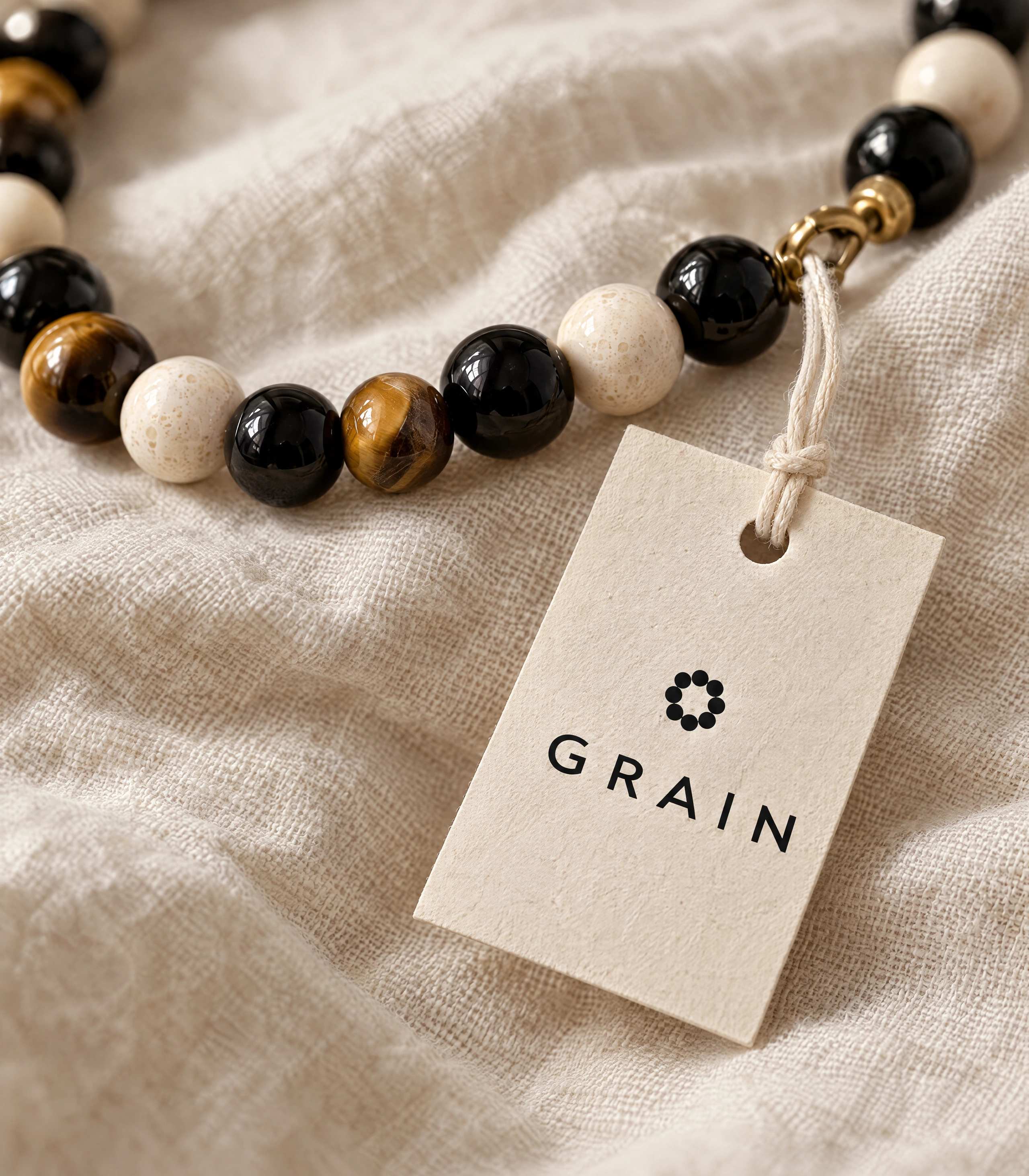
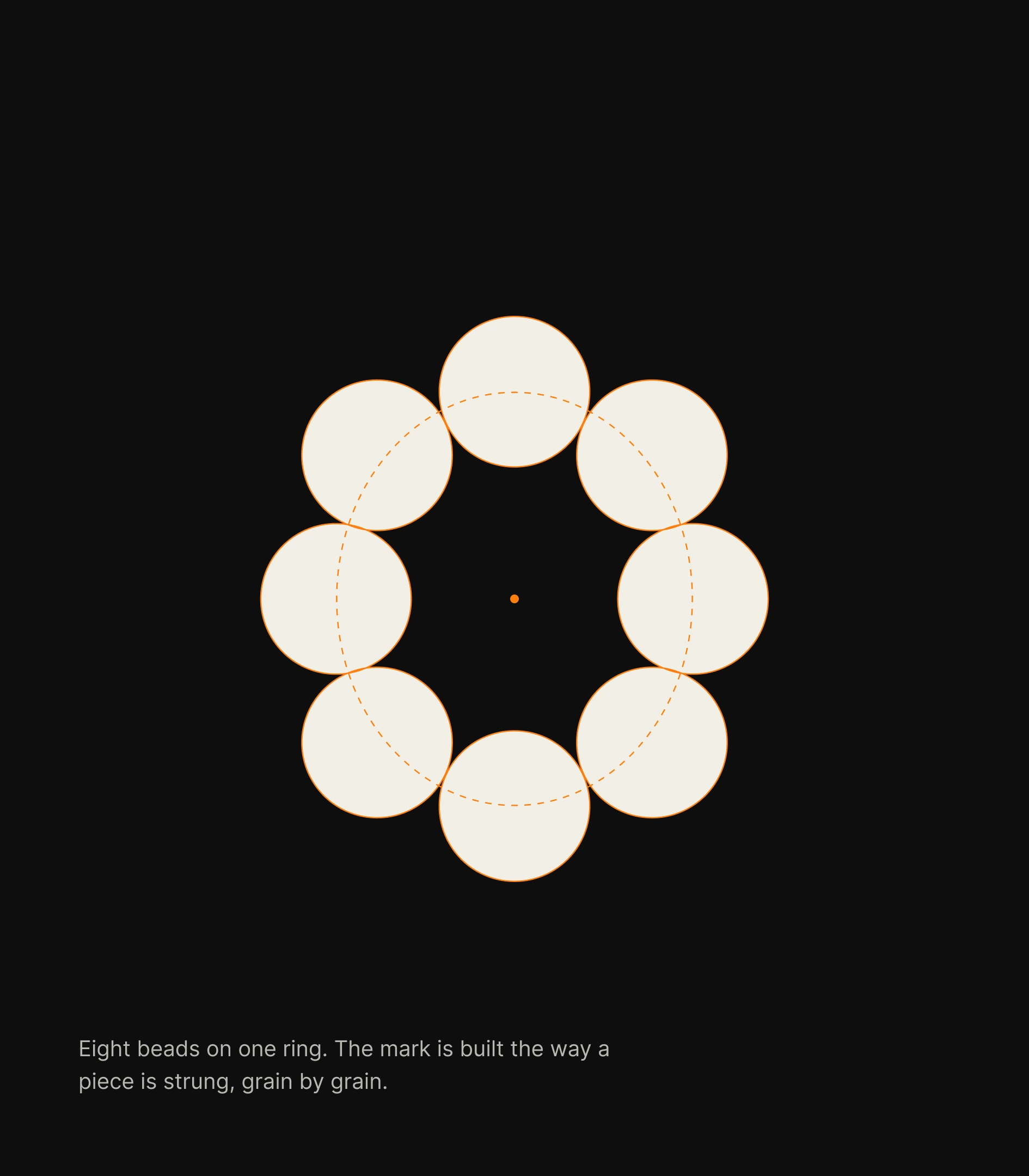
GRAIN is a young jewellery brand: onyx, tiger's eye, fossil stone and river pearl, assembled by hand in small runs. The work covered the whole brand, from the wordmark and the eight-bead symbol to colour, type, packaging and photography direction, and the online store that sells it, in English and Czech, in crowns and euros, with shipping across the EU.
- languages and currencies: English and Czech, CZK and EUR
- 2 × 2
- EU countries in the shipping zone
- 26
- products at launch: necklaces, bracelets, sets and a gift card
- 17

Quiet, not empty

Challenge
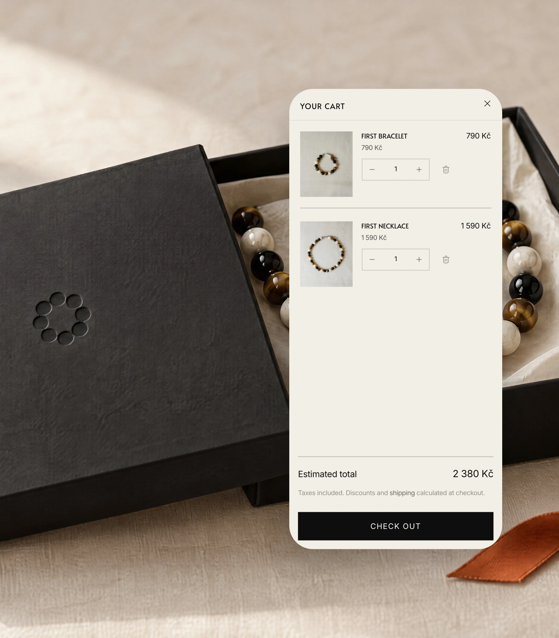
A small catalogue, a premium positioning and no budget for an agency or a developer. A stock Shopify theme reads as a template the moment it loads. The store had to feel as considered as the pieces it sells, work as well on a phone as on a desktop, and stay editable by the founder without touching code.


Shopify, designed and built with Claude

Solution
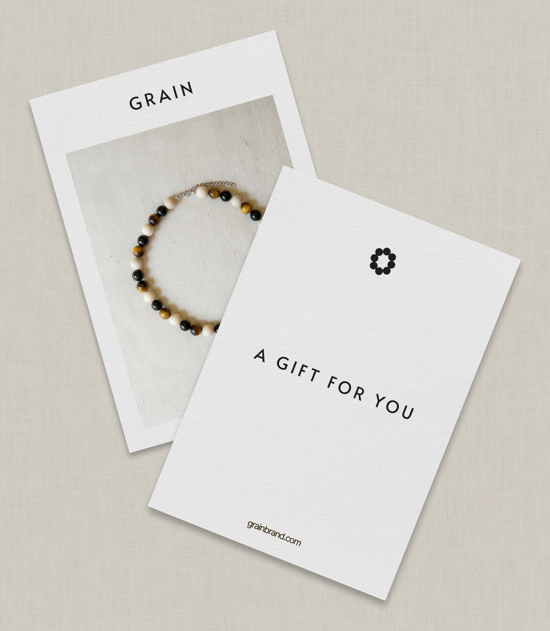
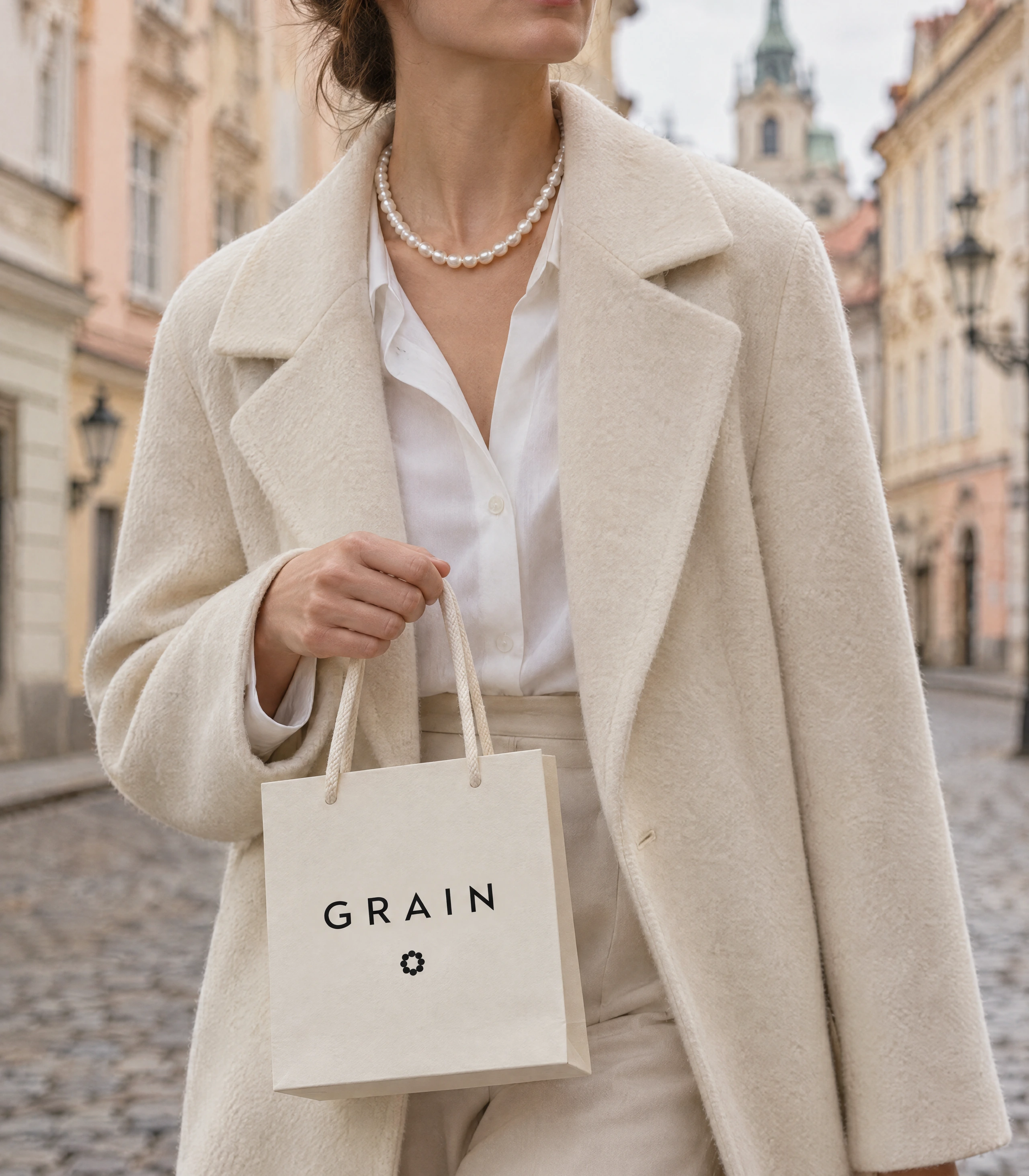
The identity starts from the product: eight beads on one ring form the symbol, and the same idea, grain by grain, runs through the packaging and the brand film. The store is a free Shopify theme rebuilt section by section with Claude Code. Design decisions, review and sign-off stayed with the designer; code, local previews and checks ran through Claude Code, and nothing went live without an explicit go-ahead.