UGO
- Client
- UGO
- Year
- 2025
- Scope
- Strategy, UX/UI, Design system, E-commerce
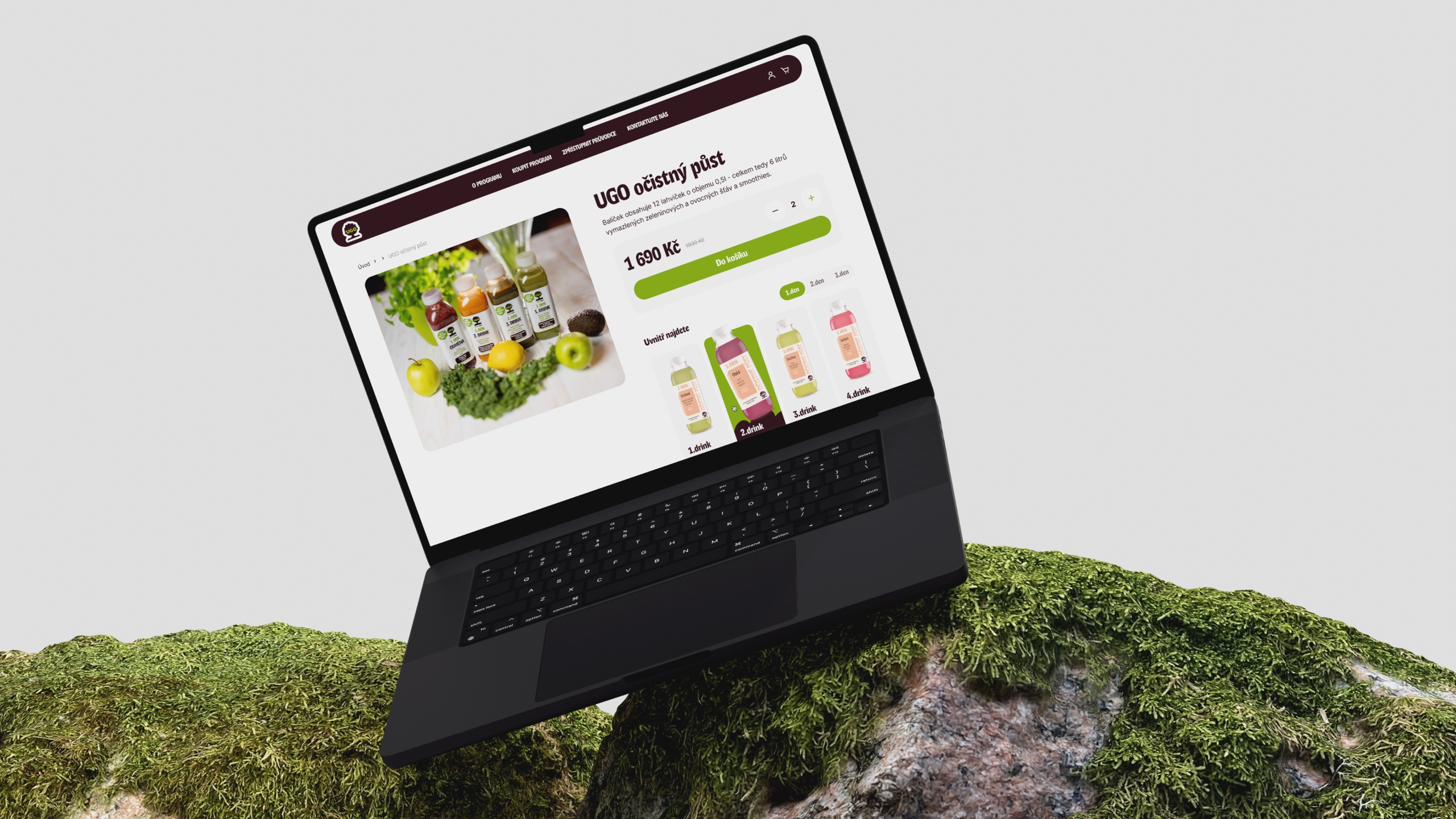
UGO runs more than two hundred fresh bars across Czechia, pressing juices and making bowls from mostly plant-based ingredients. Its website had fallen behind the brand. The redesign rebuilt it end to end: a shop, a franchise funnel and a design system to hold both.

Context
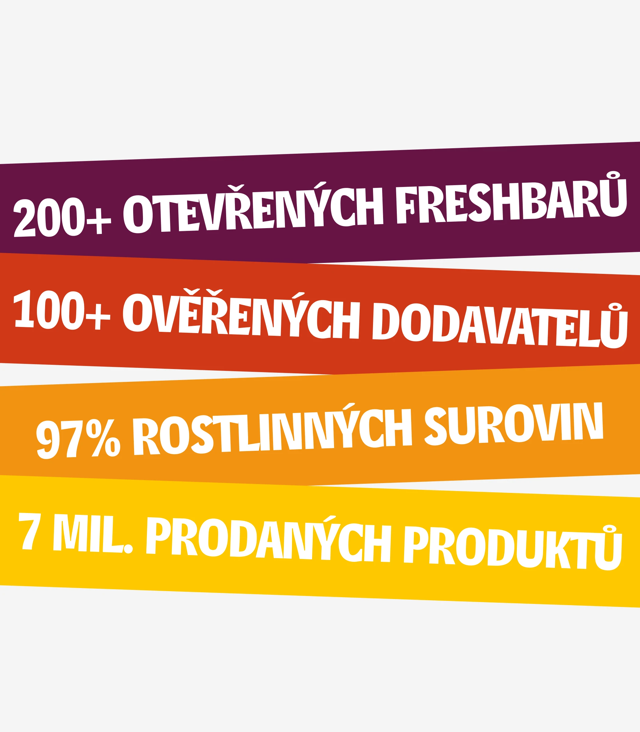
UGO is a Czech healthy-food brand with 200+ fresh bars, 100+ verified suppliers and seven million products sold. The old site mixed an e-shop, a brand story and franchise recruitment without a clear path through any of them, and it no longer looked like the bright, playful brand people knew from the bars.
Three visitors, one site
Challenge
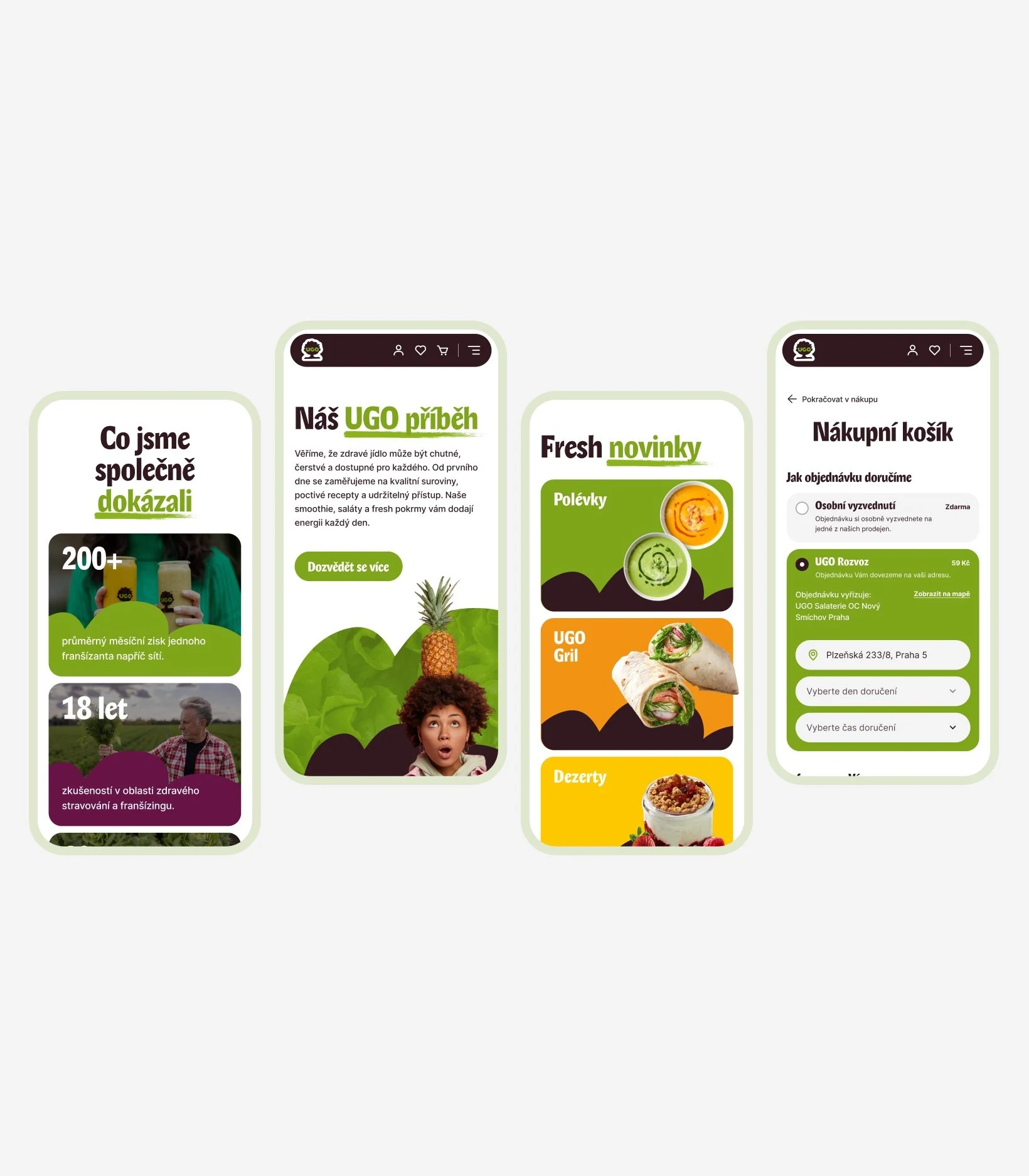
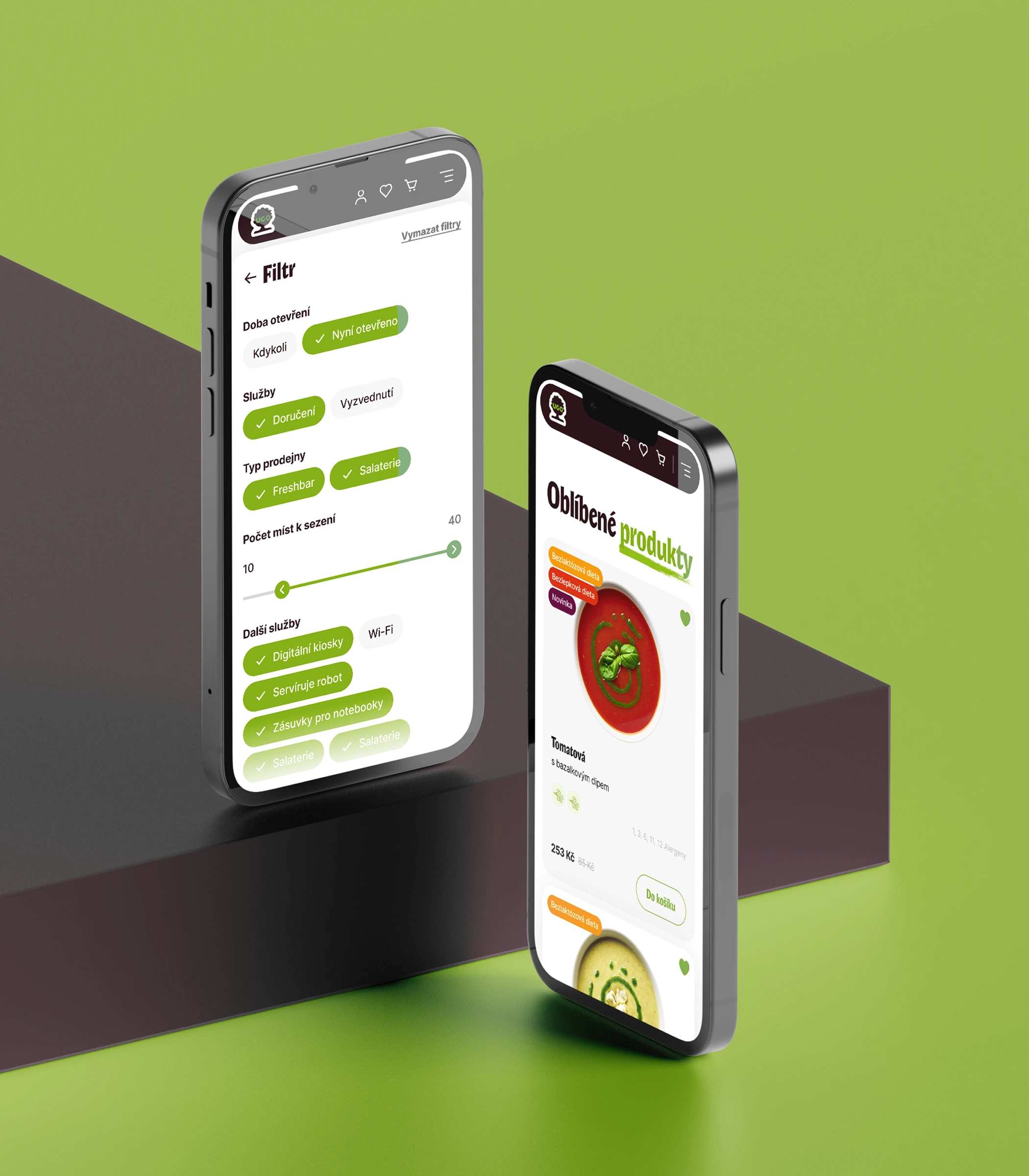
Three audiences share one site: someone ordering a juice or a bowl, a regular reading about ingredients and recipes, and an entrepreneur weighing a franchise. Each needed a clear route of its own, on a phone as well as a desktop, and the brand's playfulness had to survive the checkout.
A palette named after the menu

Solution
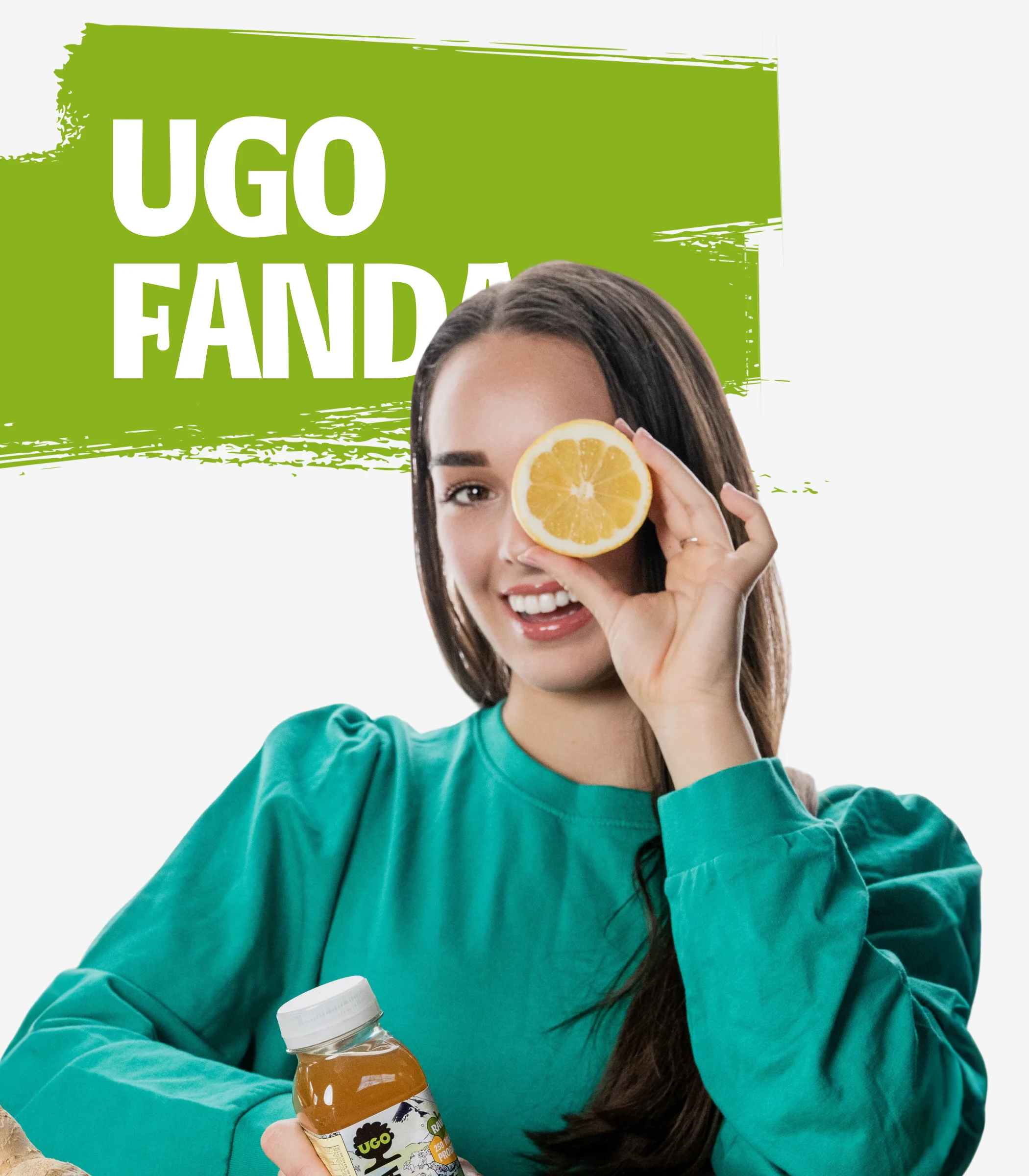
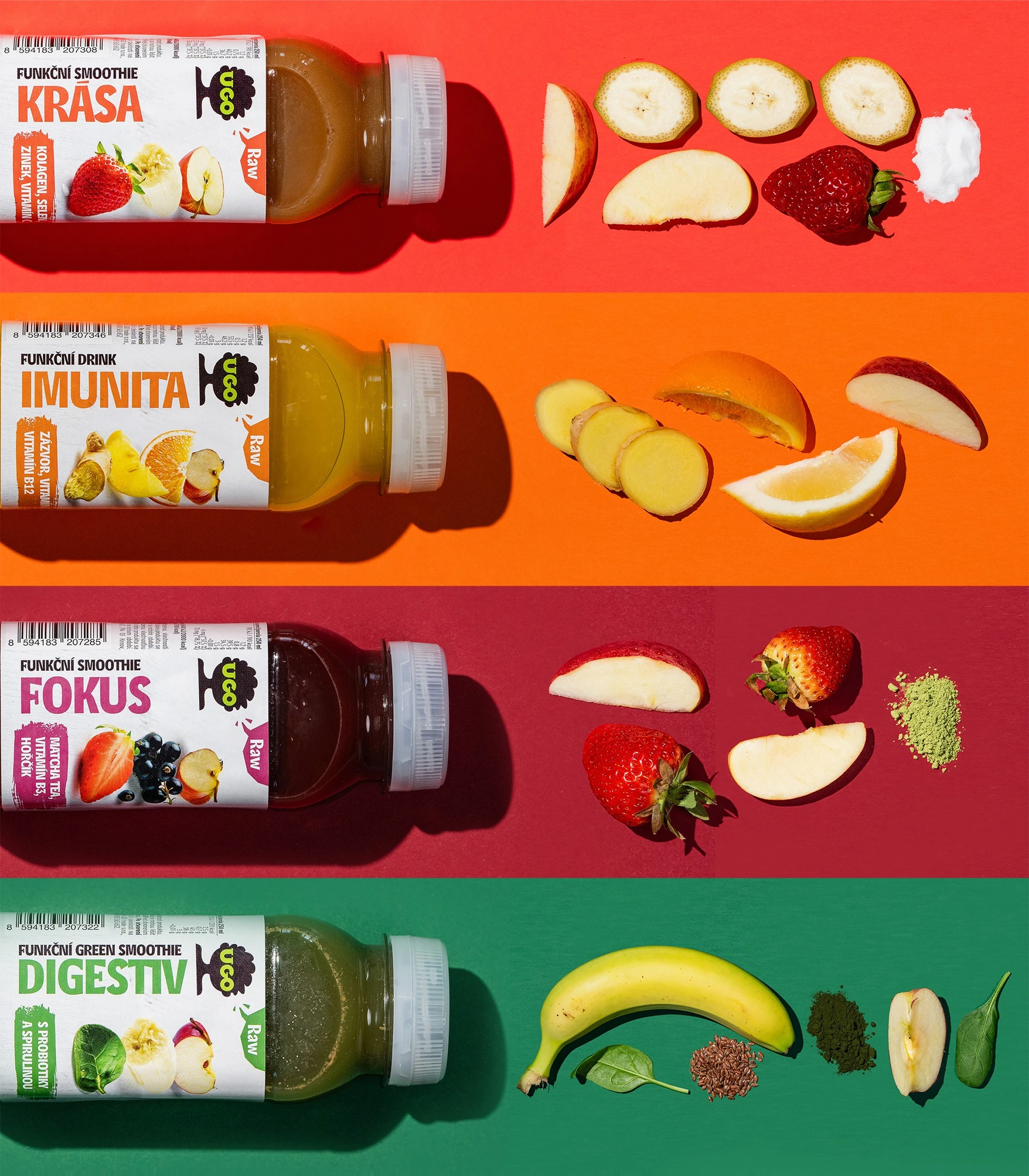
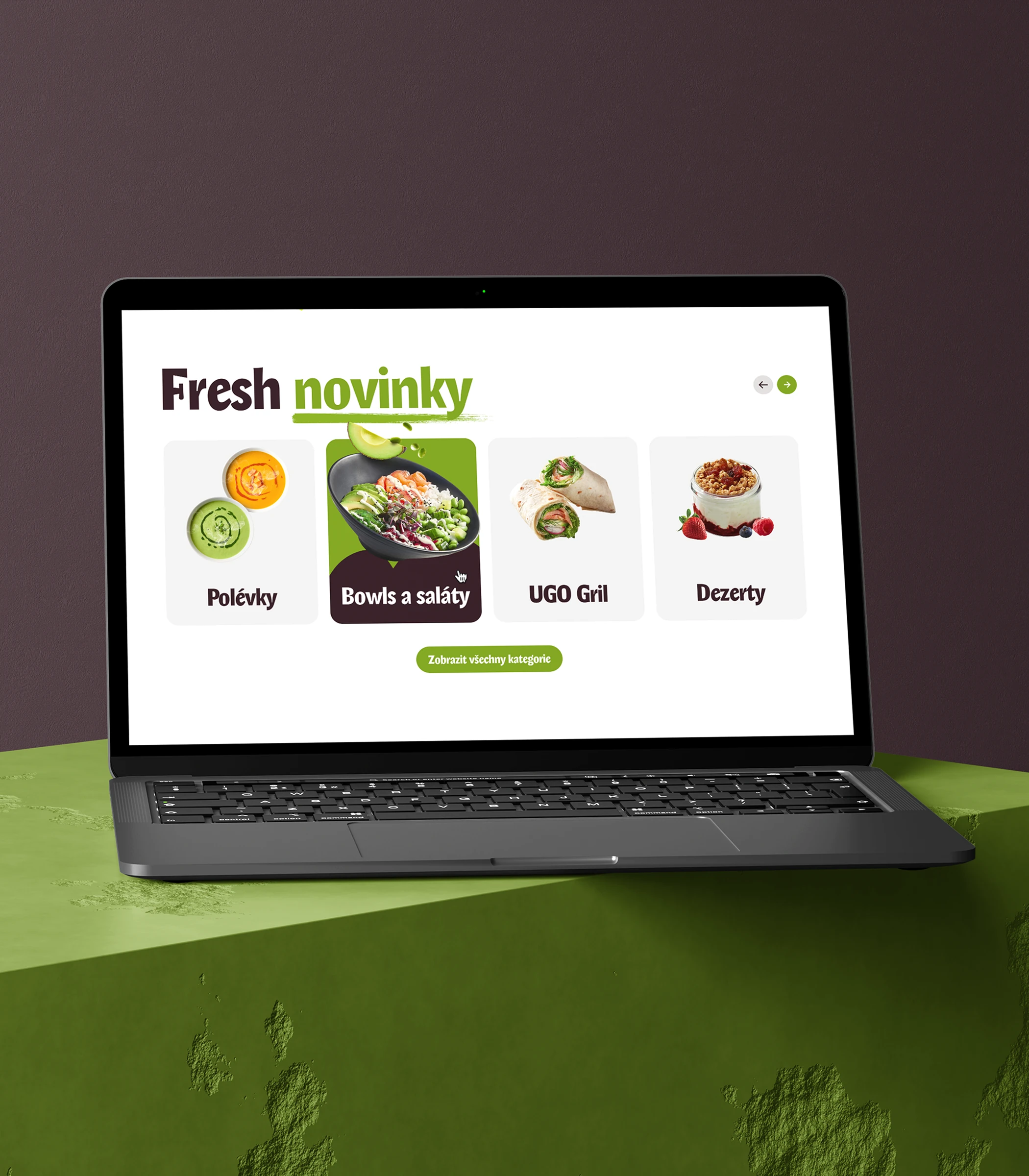
The shop covers the full path, from catalogue and product page to cart, checkout, payment and coupons, for registered customers and guests alike; UGO Fanda, the loyalty programme, gets its own sign-up. The franchise funnel has its own pages, FAQ, locations and contact forms. Around them sit a blog, an Instagram feed and a map of the fresh bars. Everything runs on a design system built from scratch: buttons, inputs, product cards, chips, navigation, typography, and a palette named after the menu — UGO Green, UGO Brown, Paprika, Papaya, Zucchini, Grapes, Melon, Cabbage and Berry.